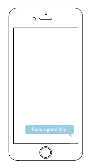
Cheer Up You is a mood-boosting app aimed at anyone wanting to gain or share a little happiness. Through the use of positive messages sent automatically and by other users, the app is designed to help people receive some positivity in a more natural experience rather than alone or through direct request that can be uncomfortable. The app functions as both a personal use item and social media platform, the choice of interaction level left up to the user.
This work was completed as a final project during my Interaction Design class taught by Kristen Johnson at Northeastern University.
You can view my final presentation here and the mobile prototype here.
Research & dev
What should or shouldn’t this app do? With social media apps running rampant, creating an app that wasn’t redundant or inferior to other apps that served the same function was the goal here. The freedom this class offered us (“Design the app you’ve always wanted to.”) was exciting but a lot to think about. I wanted to make, at its core, a compliment app: somewhere people could receive a certain volume of positive messages based on their set mood.
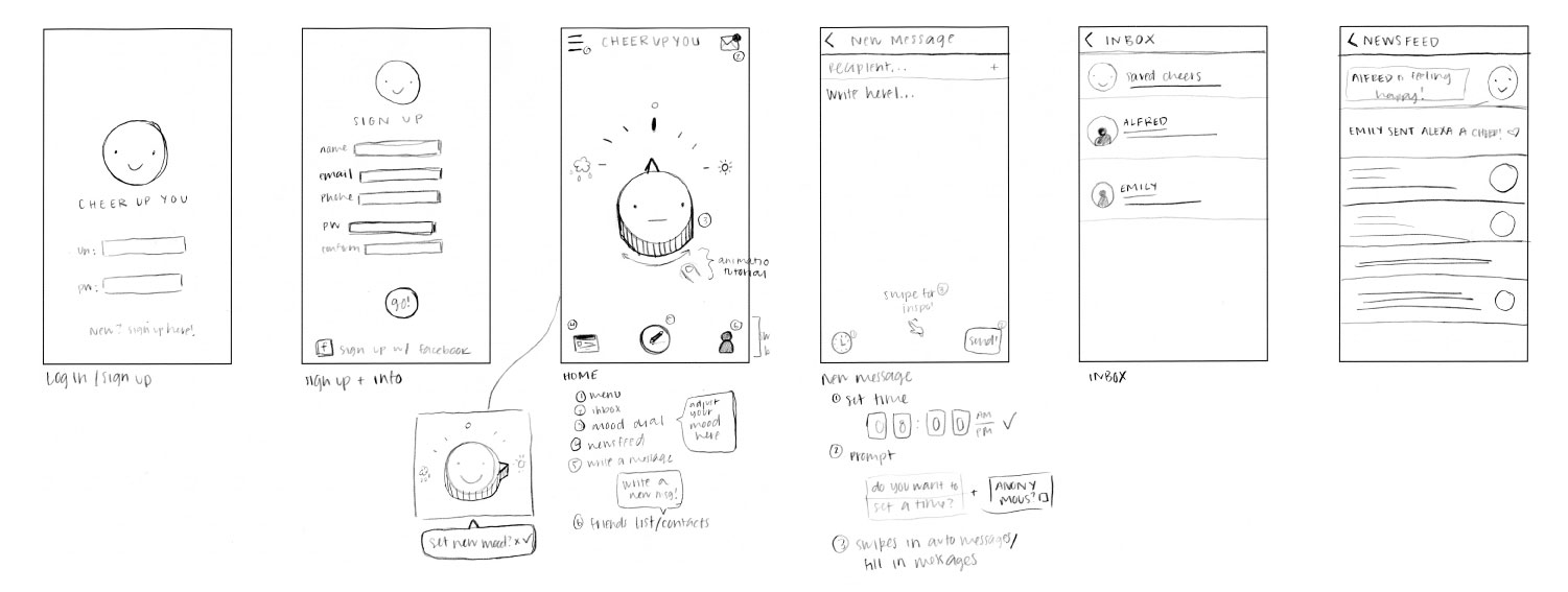
In the early stages of development, I had planned for the app to be solely for personal use. However, after user research and some competition benchmarking, it became clear that robot-generated messages didn’t offer enough genuineness. So, Cheer Up You would need to become more of a social app. From here I broke down its functionality into three main categories: personal mood tracking, social mood sharing, sending/receiving messages.
user flows & wireframing
In this stage of the process, I was having a hard time figuring out how user flows would go. As mentioned before, I had simplified the app’s core functions into 3 areas, but I wasn’t sure of the most intuitive way to navigate to each of them. While I drew out wireframes, I was constantly looking at other social media apps’ interfaces and how they chose to layout their information. I actually ended up finding Venmo to be a very useful model since it had similar areas of function: main use (exchanging money) + social aspect. So, I tried to follow this 3-page structure (Home, Feed, Inbox) to keep things simple and straightforward.
user testing
The next step in this process was to build a prototype to run some usability testing. Using a digital prototyping app, I was able to quickly put together a rough idea of how the app should function. Following, I ran tests with 5 different participants. Results can be seen here.
Mostly what I got out of these tests was that while the usability of the app seemed straight-forward, some clear visual design/UI would really aid in helping users navigate their way around the app.
logo + style
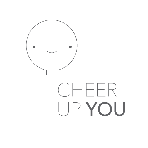
Finally it was time to get into my favorite part of the design process: visuals! We started with logos, which I thought seemed a bit out of order, but I’m actually really grateful my professor had us do these since the feedback for my logo ended up informing some of my UI choices.
My professor had as sketch out a bunch of logo ideas and number them. As class, we all voted on our favorites for each project.
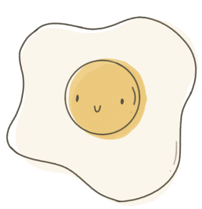
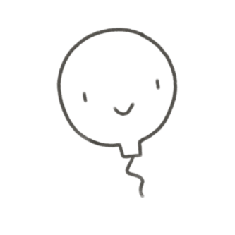
I was a big fan of the simple smiley face, but the balloon logos got a lot of love from my peers.
ui exploration
I had been really excited about doing the UI for this project since the beginning. I had this vision of a little dial with smiley face on it from Day 1. While I was mocking up different directions, I decided to throw in the balloon since it had been such a favorite with my peers, but I was positive the dial was the most intuitive and just fit the app.
During the crit session, I actually ended up receiving an overwhelming amount of positive feedback for the balloon direction. I was a bit reluctant to let go of the dial since it had been in my head since the beginning but soon realized the appeal of the balloon: it made everyone happy! And, that was ultimately the goal of the entire app.
The balloon-theme (from implementing it on the main page to figuring out how it could be put into a newsfeed) quickly became one of my favorite parts of the entire process. I think the heart of this whole project ended being the appeal of the UI.
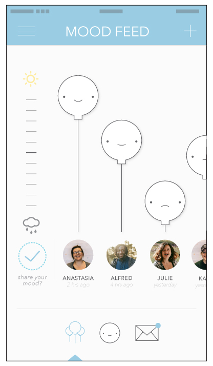
initial feed
final feed
finishing touches
As a final addition, I added a mood tracking function after a classmate pointed out that it would seem really helpful and cohesive. I got to work on all the on-boarding screens, make a super cute ‘Loading’ screen, and also designed a few screens for the web version of the application. The app, I imagined, would be primarily used on mobile devices, so I essentially made a bigger version of it for desktop with few changes (think Instagram’s web application).
final remarks
Since this was a class project and didn’t have the constraints of a real client, it was a great exercise in creativity and allowed me to flex a lot of the UI designs I’d been hoarding since sophomore year. Although the process for this guy wasn’t perfect, I was able to see how the design process might exist inside a vacuum with no external constraints.