Knotch

report generator

background

Knotch offers an analytics platform for content driven companies looking to better understand and optimize their customer journeys through first, middle, and last touches. Users were most often marketing teams trying to answer critical questions around their content performance. 

Our team at Knotch consisted of our head of product, two front end engineers, myself, and one other designer.

Initial design
final design (Prototype)

The Problem

In order to see how specific groups of content were performing, our users needed to generate reports in the Knotch app. The original report generation flow consisted of users selecting the date range and then choosing which folders, tags, or individual content pieces that they wanted to include in their report all on one screen. 

However, the customer success team came to us with this problem: clients were expecting their CSM to generate the report for them because they could not figure out how to do it on their own.

Research & Goals

After conducting an audit of the current report generator and trying myself to generate a report based on a real request that a CSM had shared with me, I interviewed 2 CSMs who managed two of our largest clients. I had them walk me through what kind of requests their clients usually had, how they went about creating a report to fulfill them, and any feedback they had received about the report builder itself. With the findings, I set two main goals. 

FINDINGS

  • Most requests were for reporting around very specific groups of content, usually time period or campaign based 

  • Content organization in most of their clients’ libraries was too messy – inconsistent tags, content in the wrong folders, etc – to efficiently add what they needed (the folders/tags system itself was a whole other project we had to tackle later)

  • CSMs struggled with understanding the overlap of what they had or hadn’t “added” to the report and had no way to mass add content by certain criteria

  • Feedback from customers was that the reporting tool was very confusing, cumbersome, and not powerful enough

GOALS

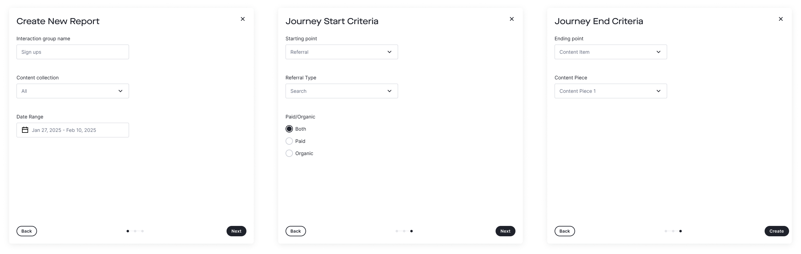
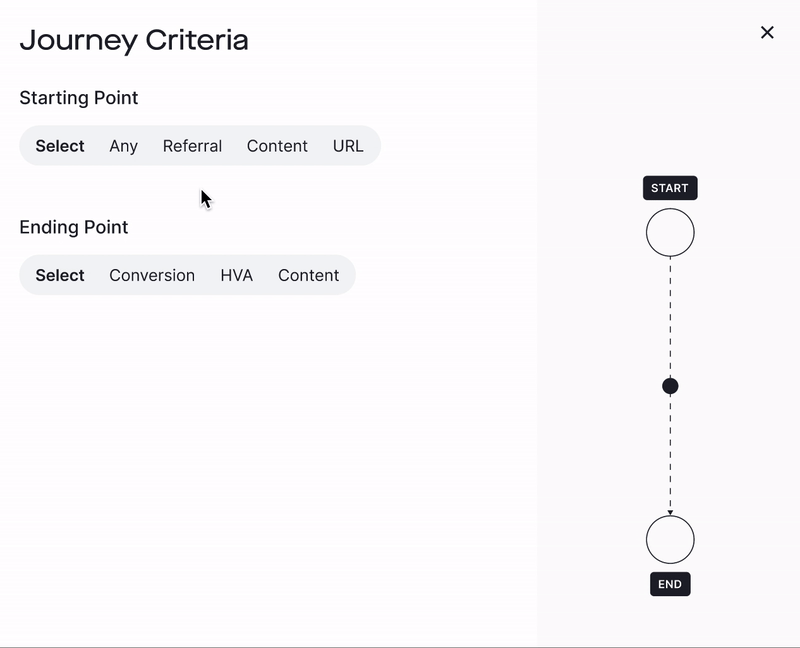
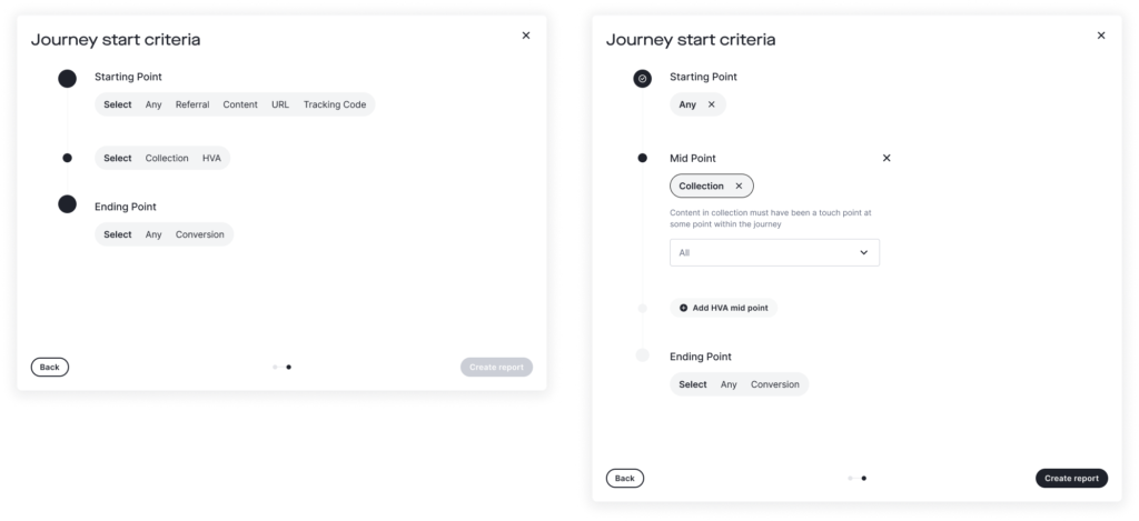
More User-Generated Reports
Make reporting flow more intuitive so that users create reports on their own

Success metrics:

🟢 Increase in user-generated reports
🟢 Increase in reports created overall

Improve UI
Revamp and push the boundaries of existing components to keep up with Knotch’s rebrand

Success metrics:

❤️ Qualitative: is this flow pleasant and repeatable?

IDEATION & Prototyping

V1 - Still manually bulk adding but make it suck less

Initially, I tried to focus on resolving the issue of folders and tags existing on the same level. Users were able to add entire folders and tags with no idea of overlap and no clear logical path to narrow down their selections.

I created wireframes of a new flow that was more linear: 

  1. Select your folder(s)
  2. Filter by your tag(s) that existed in those folders
  3. Review/remove any individual content pieces you didn’t want 

I tested these wireframes with more members of the CS team and was met mostly with positive feedback on improved clarity but also some pushback on whether folders were the correct starting point – some clients only utilized tags, etc. 

Due to tech constraints and time pressure, I decided a good solution for the interim was to move forward with this direction under the justification that it would encourage our users to better use their content organization tools, i.e. tag content and place them in folders that were actually useful.

V1 moved away from the single page to a step-by-step modal featuring a running content count

Feedback from our CSMs showed that the process for generating reports was easier for them but still wasn’t convincing our users to do it on their own. It seemed like the current structure of our folders/tags system was giving them trouble, and many of the approaches of this method (manually bulk adding) would be challenging for even the most advanced of power users. (Spoiler alert, this launched our new tags and labels project.)

V2 - The Customer Journey

After we shipped V1 of the new generator, the product and design team turned our attention to building out the newest version of Knotch → KnotchPro. This included rebranding the whole company, establishing an entirely new design system, and shifting the product’s focus from granular content performance to a more holistic view of the customer’s journey through content pieces. 

Our next version of the report generator removed all manual adding/removing of content pieces and focused solely on automatically selecting content based on journey start and end criteria.

We built out a prototype that consisted of just dropdown selections to give the backend team an idea of the requests they would be handling. At this point, we had Goal #1 in a good place, but Goal #2 was still falling short. On top of that, the marketing and sales teams were preparing to demo the new platform for potential new clients, and in its current state of black and white dropdowns, the report generator was not delivering on Knotch’s promise great design.

V3 - Life's about the (customer) journey, not the destination

At our Head of Product’s  request that everything feel visual and “like you’re actually going on a journey,” I started trying out new styles on the generator with a lot of inspiration from maps and trying to incorporate more animations to make our product feel intentional.

View the final prototype up above!

A slide-in side menu not only provides more space but also allows our users to bulk select and add multiple content pieces at once.

RESULTS

We weren’t able to track the numbers we wanted initially due to the focus on the launch of KnotchPro, but our marketing and sales team were able to use the report generator prototype in demos to new potential clients. 

With the reporting feature as one of KnotchPro’s main selling points, 

Knotch closed on three 6-figure deals and the very first 7-figure deal in company history.

Qualitative feedback from both CSMs and potential clients was that the new generator was “straight-forward and just makes sense.”

final tHoughts

Future iterations and design system updates
We continued to iterate and improve on the report generator post KnotchPro launch with the guiding star of keeping it straight-forward and intuitive the way our users  appreciated. One example is the addition of midpoints, which allowed users to require certain content pieces to be touched or actions to be taken in the middle of a journey.

The side-by-side modal also became a staple in our design system, showing up again in other projects like our Interactions builder and In-browser selector.