

TONE
onboarding flow
all aboard the onboard
Text message marketing is quickly becoming a popular communication channel for a lot of online retail stores. But, turns out people get mad (fast) when you text them without permission and turns out also, you can get in a lot of legal trouble. 
Another big project I worked on for Tone was creating a new onboarding flow that included clear information on why and HOW stores must be TCPA compliant while still keeping them engaged and eager enough to complete the entire process.
Spoiler alert: after reaching the beginning of the high fidelity design stage, this project was bumped back, allowing a different project to be prioritized. RIP. A lot of good work was still done though and will hopefully see completion in the near future!
You can view the WIP prototype below!

Step 0 of the original onboarding flow.
the problem
Before you get too alarmed that a bunch of Tone clients are running around being not TCPA compliant, Tone’s original onboarding flow does currently include a step where users are instructed to set up a compliant checkbox.
Unfortunately, this step is a long list of tasks that users don’t really understand. Also, it is skippable. 💀 So, of course, people skip it (and have to be chased down by our sales team to set it up later). If they even make it that far, that is.
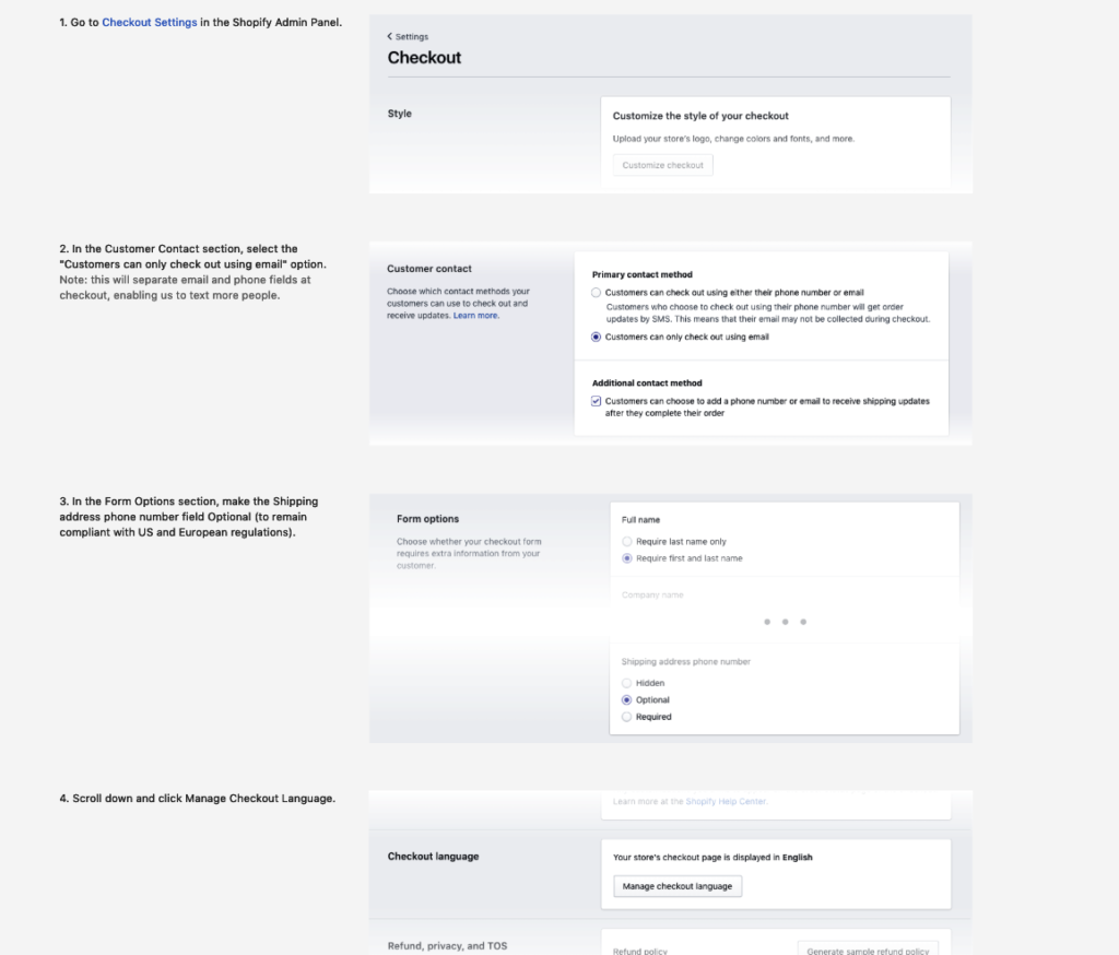
The dreaded Step 4: Opt In Setup
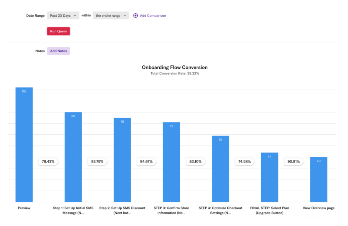
To begin, we did a quick study on the current onboarding flow conversion. Unsurprisingly, the biggest fall off occurred at that crucial compliance/opt-in set up step (Step 4).
Though clearly a major pain point, the compliance step was not the only issue at hand. After a brainstorm sesh with our favorite account executive, Matt, we found that if clients didn’t drop out of the flow (which they did a lot, especially without assistance), they would often still need to call him needing help setting up the rest of their account, understanding what was going on, etc.
The next step in our process was to figure out what our clients and potential clients needed and wanted in an onboarding flow to best set them up for success.
moving target
Tone’s client base varies a lot in size. There are thousands of shops using the app, from million dollar top brands to random person selling clothes out of their garage. We quickly realized that with this range of users came a range of needs.
The first thing we did was try to break our client base down into different groups based on size. We came up with four different personas:
We carefully considered who it was we needed to target, and it became clear that the success of our onboarding flow lay with the ability of Small Sams and Medium Monicas to get through it easily. With this, we created a set of two goals.
The goals
- CONVERT. Get users through the onboarding flow.
- INFORM. Give users enough context to understand what was going on.
As you can see, these goals were not easy. They seemed to be at two opposite ends; something we had to balance. We wanted to get users through onboarding as quick as possible! The faster the set up, the less the likelihood of fall off. The Sams and the Monicas went through a lot of apps, so anything that took too long would probably be a deterrent. However, if they moved too fast and reached the dashboard with no idea what’s going on, they might not stay. We had to find a delicate balance of efficiency and information.
powerpoints & trello boards
The established goals let me walk away from the larger group brainstorms and really carve out some viable directions. I came up with three distinct directions we could take the onboarding flow in, each with their own focus and flows.
I wireframed each direction out and walked management through them to help them get a feel for which they thought would be the most valuable.
the 3 Directions
BUY NOW
Conversion
LEARNING
App Potential
SET UP
Guided Help
Buy now was focused on speed. Everything that could be optional was removed. Any set up of features or products was left up to the user, to be complete once reaching the dashboard.
Learning provided some information on some of the Tone products and allowed users to set some of them up if they chose to do so. The main goal with this direction was to hype the user up on all the cool things they could do once installed so that they would willingly set them up later.
Set up was just like the name: setting everything up. By far the longest approach, it walked users through a majority of the features and pushed them to set up and customize as much as possible, giving them a real sense of ownership over the app. As a result, once reaching the dashboard, all they had to do was let the app do its thing.
We all agreed that Sam and Monica would benefit most from a fusion of Buy Now and Learning.
Then came the next part: deciding the order of the steps.
To facilitate discussion, I came up with an activity for all the major stakeholders and me to complete. From the wireframing I had done before, we now had a good idea of all the screens/steps necessary for the flow. We then used Trello boards to create our own versions of what we thought the progress bar/stepper should look like. Since we were remote (COVID times) by this point, it was a good way to keep things interactive and visual.
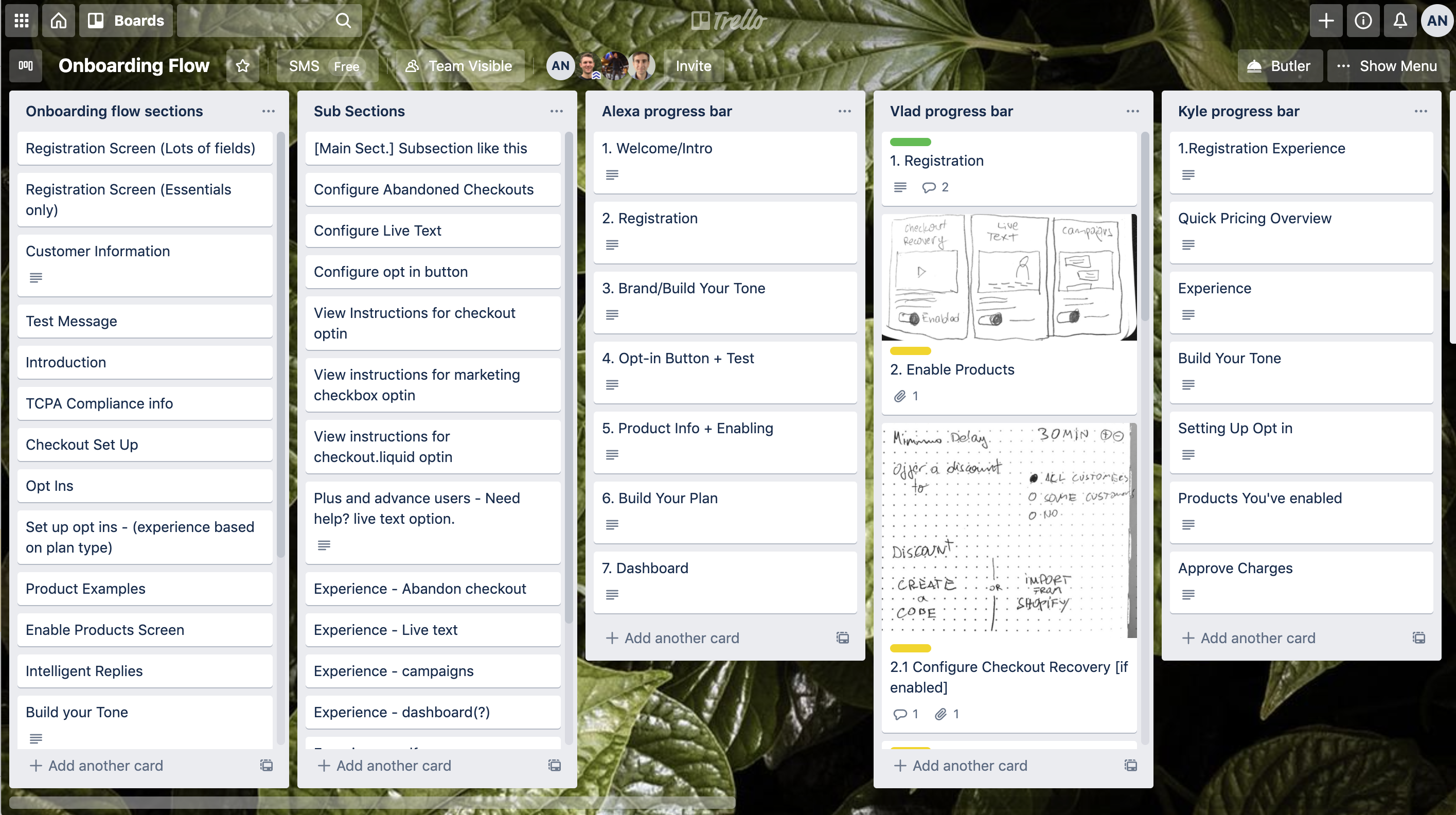
Our Trello board activity.
prototyping
Finally, it was time to build out a prototype. This is where the timeline started to get a little shaky. I created some mid-fi (is that a term?) screens that included a brand new (and user friendly) pricing page and a step-by-step guide to setting up a TCPA compliant checkout page. We decided to prioritize the compliance step and possibly implement that as a V1.
For the new and improved compliance setup page, I wanted to make sure that completing each of the steps felt quick and snappy for the user. This step could no longer be skipped, but my goal was to make it seamless enough that users wouldn’t even think to skip it.
To achieve this, I went with a card carousel type approach. The user would be given as much context before they began the setup: why they needed to set this up, how long it would take, and what it would look like when they were finished.

As users completed (and marked) each step, the next step would appear. There would also be a progress bar always visible to encourage the user to reach the end. I also decided to create more dynamic graphics for each step instead of just screenshots. Each card also features an instructional gif/video with captions on what to do.
When we tested the new compliance step with a small group of users, it was super interesting to see the different kinds of learners we had. Some people opted to just watch the videos and go from there, and others strictly read the instructions and didn’t give the videos a second look.
We actually ended up being able to cut a bunch of steps that users found unnecessary and simplify that set up to take less than 5 minutes.