embarc
concept + branding
embarc on an adventure
Embarc is a travel app that turns your friends into your travel agent. Through blog-style posts, users can create shareable itineraries with trip highlights and recommendations. From there, friends and followers can save or even book the same trip for themselves. Embarc aims to be the one-stop travel app for all your needs, from recommendations to price comparisons, all the way to booking.
I hopped onto the Embarc project at the very beginning as a contracted product designer. When we started, we were still at phase “So I have this idea…”. By the end of our time, we had a fully designed prototype (consisting of onboarding, profile page, and content creator) and a refreshed brand guidelines.
You can view the prototype below, and you can check out the new brand book here!
research & dev
Coming into this project, I was provided with a small user research report and a rough draft of a brand guideline. Alex, the founder, and I sifted through the report and discussed where he wanted to go with the project based on the user research, and he had an endless amount of ideas.
My job for this project was prioritizing what we needed for V1 and hashing out details of how the features would work. So, we started to delve into what his ideal end version of the app would be so that we could work backwards and figure out what foundation would be the most efficient in the future.
Alex wanted the app to be essentially a mashup of some of the most popular social media platforms with all the best travel apps. We came up a list of functionality for the app:
- Itinerary Builder — Creating, publishing, viewing, and sharing trips.
- Social Media Profile — Following other users; viewing all their posts/trips in one place.
- Discovery Feed — Viewing user-created content (trips, recommendations, locations) in a personalized feed or via search.
• Needed to include some type of tagging system
• Needed a favorite/like system - Referral and Rewards Program — Collecting points/rewards that could be redeemed for future travel
• Via referrals, post clicks, favorites, engagement, etc.
• Would need to partner with travel agencies/airlines/etc. - Booking — Purchasing everything from flights to hotels in app.

Some of the inspo Alex pooled for his app.
mvp(?)
The future looked bright for the app! But, I needed to focus on what I could achieve by myself for it at the moment. I narrowed in on the list and put on my best MVP thinking hat to ask myself, “Where is the lowest common denominator?” I’m not sure that actually makes sense, but it is always helpful in helping me figure out where to start.
We knew that we wanted to focus on at least the Itinerary Builder at the core of the MVP, but I also wanted to set good groundwork to easily move towards the Discovery Feed. I decided the best way to do this was to layout how the tagging system would work and incorporate it into the Builder.
Alex made a point that he wanted this Embarc feed to be different from Instagram in that it had a lot of different kinds of content. It could be full trip itineraries, locations, a recommendation or review, travel activities, etc.
the experience block
We came up with three different types of tags: Location, Experience, and Trip Type. The users would be able to explore things they were looking for using a combination of these tags. For example, a user could search for Hiking [experience] in Vermont [location].
Then came the architectural questions: What goes into an “itinerary?” and How do we create essentially a blog post that could be broken down into individual shareable pieces?
The goal was to be able to collect as much content as possible without users having to create individual shareable items. For instance, if a user created a trip itinerary about a recent vacation to Bali, and while they were there, they went surfing and ate at an incredible restaurant, then we wanted almost all parts of that trip to exist and be shareable/bookmarkable individually. This would allow users in the future to be able to build entirely new trips out of pieces of old ones.
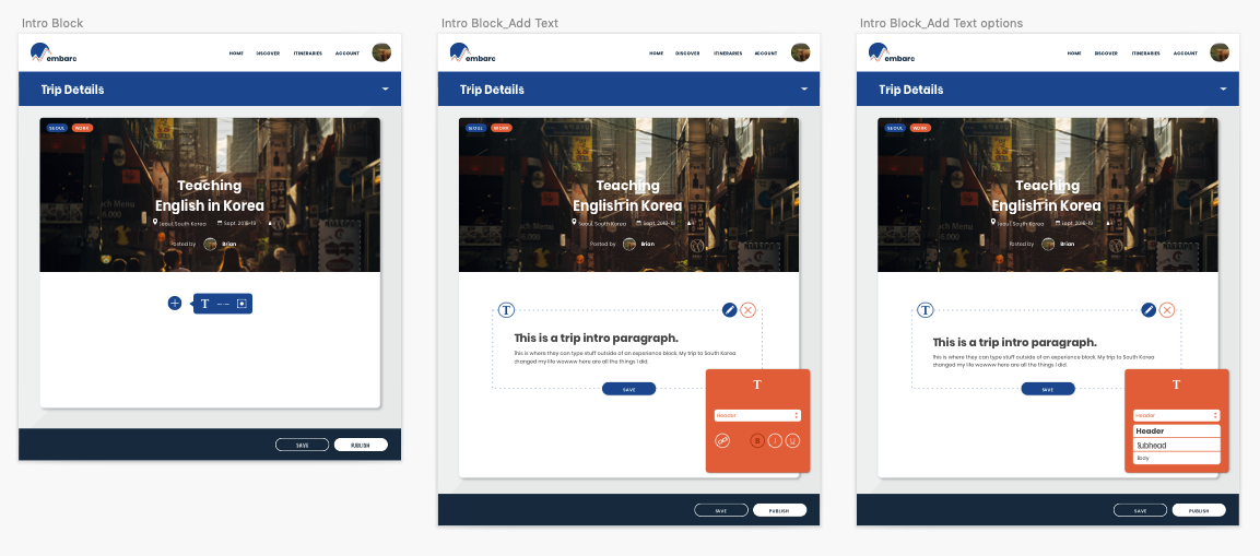
I ended creating the concept of an Experience Block. The Experience Blocks would exist within larger posts but act as their own entities and receive their own tags.
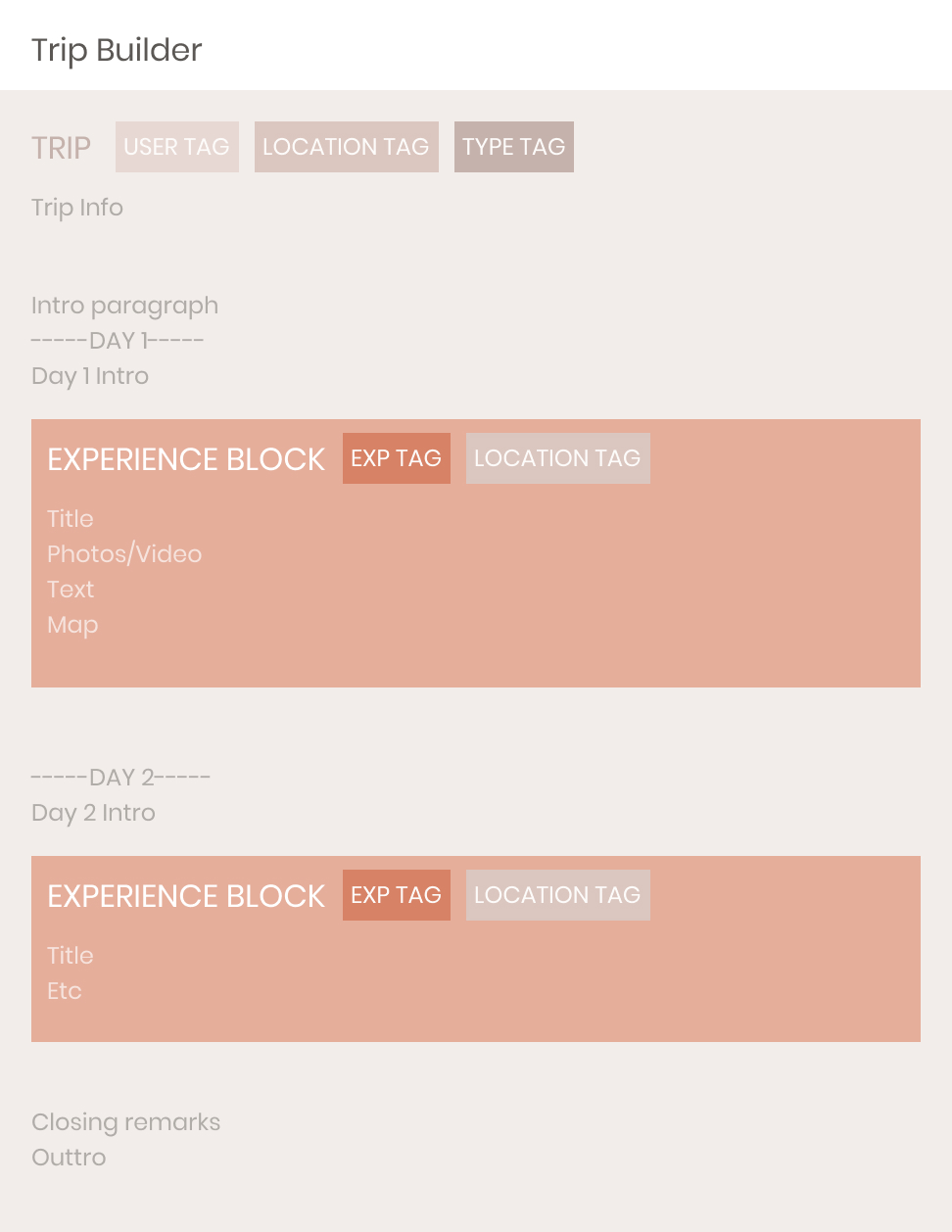
The structure of a Trip/Itinerary.
With this crucial piece of the puzzle established, I started to build out how the content creator would work around it.
building the builder
For the most part, the Itinerary Builder was pretty straightforward. We drew a lot of inspiration from typical blog post builders on the web (ie Medium). The added twist was requiring all important content to exist inside of these Experience blocks.
Another important part of these posts was figuring out how they would be organized, whether it was by time or location. One of the main personas we came up with was the Experienced Traveler. We believed that most of the content creation would be coming from them, so we wanted to give them the ability to create more long form posts for multiple day and multiple location trips. We ended up with a date system that could adjust its intervals based on the total length of the trip.
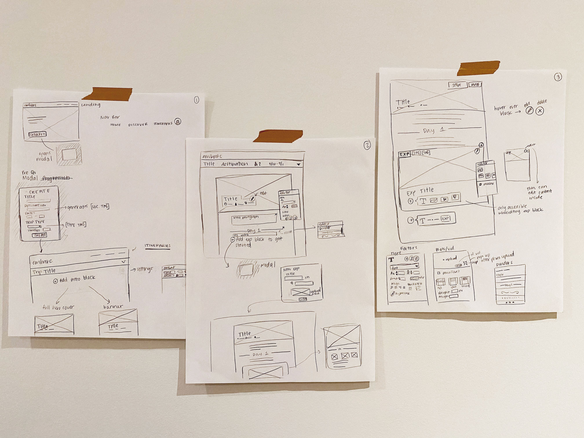
First round sketches of the builder.
After sketching out the flow for the content builder, I set to work digitizing the wireframes in Sketch. From there, Alex and I worked through how we wanted to treat everything from date dividers to photo uploaders and toolbars.
As we got the flow more solidified, I added in the high fidelity design, focusing on keeping things friendly and recognizable for the avid blogger. That meant using classic icons and imagery for all the different editing tools.
WIREFRAMES

hifi
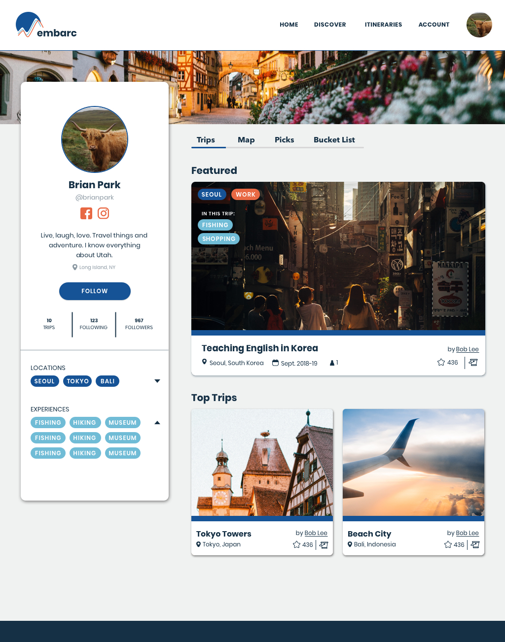
From there, I repeated the sketching/wireframing/hi-fi process to build out the registration flow and also the user profile page. Check out some of the screens below.


final remarks
Overall, this was a super fun project that allowed me to think a lot about information architecture and content in general, which I hadn’t had a lot of experience doing.
The visual design was also a bit out of my comfort zone aka a lot of thick lines, bright colors, and bubbly corners. I’m glad I got to try something new!