TONE

dashboard revamp

background

Tone is an SMS marketing and customer service platform that puts a real human behind every conversation. ECommerce shops of all sizes use Tone to initiate and maintain conversations with their customers via text message. The Tone app allows store owners/representatives to monitor and control their Tone experience. 

Three months into my Tone career, my boss approached me and said, “We’re ripping out the overview page. Ready to re-design it?” 

And, that’s how my first Big Project as a single-woman product design team in SaaS eCommerce began.

before
after

Research & GoaLs

I began user research by interviewing a mix of our clients, from our largest to newly installed. I asked questions about what exactly they used our dashboard for and what they would like to use our dashboard for. 

Their answers: “I don’t.” 

Next, we came up with a list of our users’ major problems and goals to address them.

problems

Unclear metrics 
People didn’t trust our numbers; they didn’t add up. Things like ‘Orders from Tone’ would be higher than a store’s Total Orders. There were no explanations or transparency with how metrics were calculated.


Unused tools 
Users hardly ever spent over 3 minutes in the Tone app. There was no guidance; everything was passively displaying information with no action steps or suggestions. 


Unknown value 
Users didn’t know that they had a team of real people sending out all their text messages and talking to their customers. This was particularly alarming as this is our main point of differentiation.

goals

Give (Better) Information
We needed to show reliable numbers that told a clear and logical story. We wanted to add more visibility into how we came up with the metrics, and what we suggested our users do with this information.


Create Usage
We needed to encourage users to explore the app more. There were so many features we built out that never quite seemed to make it to our users’ attention.


Highlight Humans
With human connection and real conversations at the forefront of our brand, we needed to show the value we were bringing and help users recognize they had a full team of people supporting them, creating a sense of shared wins. 

The VERY FIRST sketch of the dashboard!

Initial sketching

I started coming up with possible sections/cards to address each of our goals.

Give (Better) Information
  • A big Total Sales and ROI chart, the main chart of the page
  • Individual product snapshots 
  • A live updating plan info card

Create Usage 
  • A feed of reminders/to-do’s/notifications that prompted users around the app
  • A new footer with useful links

Highlight Humans
  • A card to showcase the senders, including their names and how many conversations they handled

Feature Improvements

After a few more rounds of sketch iteration, I quickly moved into high fidelity designs. Then before we know it, we had a brand new dash! Let’s take a quick tour of some of the main features and my thoughts behind them.

Notifications

Goal: Create Usage, Give (Better) Info

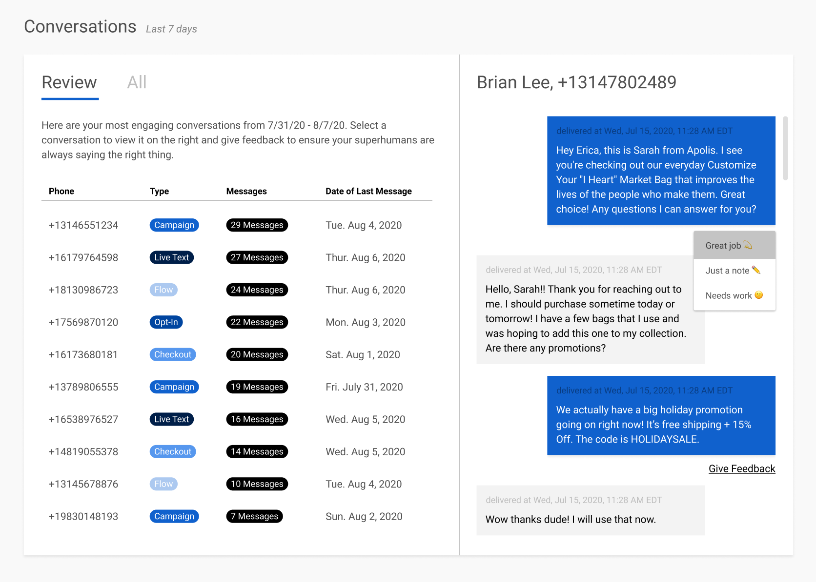
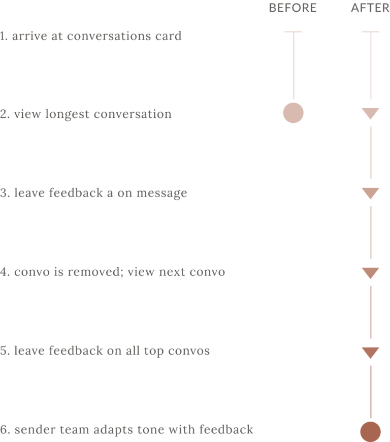
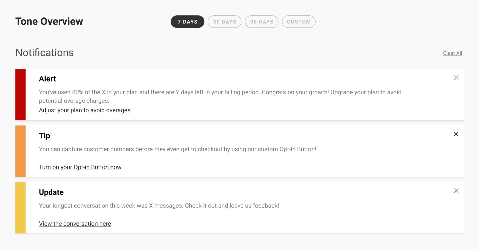
The notifications were a real driving force behind getting our users to actually use the dashboard. We came up with a bunch to help users get a feel of what was going on in the app quickly. And, we put them at the top of the page so everyone would have to look at them. 🙂

  • Alerts give users a heads up if something (usually with billing) needs to be addressed. 
  • Tips are mainly used for new installs/new features to help push users to explore things they may not know exist in the app.
  • Updates provide quick highlights into performance. Longest conversations, good feedback, etc.


The notifications are prioritized based on a point system of whether they help the business, help the user, or both. They are an all-around win: giving users more control and insight into the app’s performance, as well as acting as an upsell point for the business. 

Product Snapshots

Goal: Give (Better) Info, Create Usage

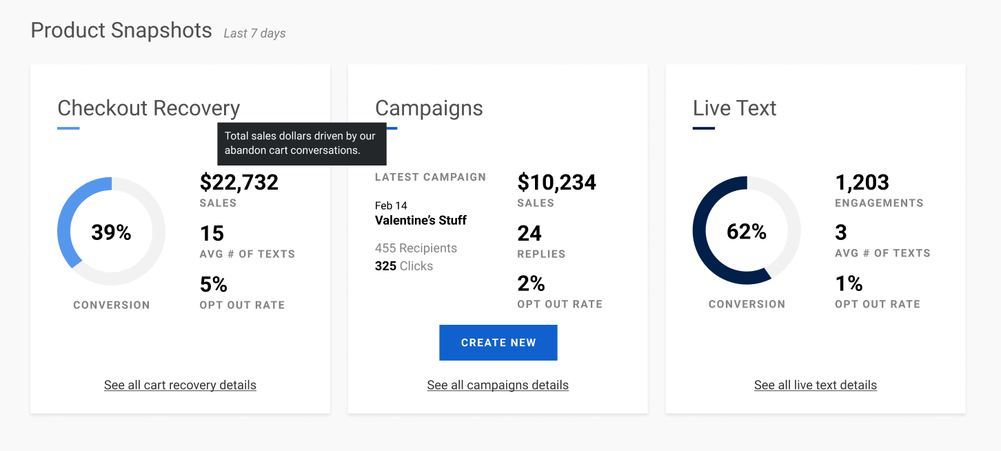
Instead of having to go to each SMS product’s individual dashboard, users can quickly see conversion rates emphasized as a visual 🍩, so they know how effective each product is at creating sales. Plus, they can view other important metrics by product, starting with sales/engagements at the top. Each metric is complete with its calculation or description on hover. 

We also pushed the dev team to re-do a lot of the math and logic going on in the background to ensure the correct numbers and counts were being shown. On the visual side, I carried the color system through the rest of the app so that users can easily distinguish by product. 

A peek into process: The first version had all the products in one card, but later I decided they all deserved to have their own card, reducing clicks for the user.

v1 product SNAPshots

multi-tab card

v2 product snapshots

individual cards

Conversations Card

Goal: Create Usage, Highlight Humans

Finally, the new and improved conversations card! We wanted to put an end to passive conversation viewing, so we shifted the focus of the conversation card from just displaying messages to instead gathering feedback, completely changing the customer journey.

The new Review tab presents top conversations (viewable immediately in-card) that disappear as users give feedback on them, creating a feeling akin to clearing a to-do list. The improvement of this experience has put more and more conversations in front of our users’ eyes, which has both showcased the work their sender team puts into responding messages and increased overall engagement with this card. It also creates a continuous feed of feedback for our senders, allowing them to better meet our users’ expectations.  

The Customer Journey: Conversations Card

final takeaways

Successes
This project was huge, especially as a young designer in a new field. The amount of work I put into this makes me really proud, especially now that it is live in the wild! One of the biggest compliments I received from a coworker was, “You just single-handedly did the work of an entire design team.” There are two other things that I am particularly proud of:

      1. Average feedbacks given in a day increased from 6.7 before launch to 18.3 just one day after our launch announcement!

      2. An average of 5 brands send thank yous to their top superhuman daily.

Challenges

This case study mostly only covers the design portion of this project, but the large second part of it was the development stages. Being PM-less was an incredible challenge. It was a struggle trying to create documentation, scoping the entire design, weighing business priorities vs tech debt, and the like all on my own. And, even after that, as the engineers ran into hiccups and bugs, I had to be ready on the fly to think of design solutions. Was definitely a hustle, but we did it! Shout out to the amazing Camp Revamp team that brought this monster to life.